JOIN the AFICIONADOS
Get the insider news and lowdown on what we've been up to, where we've been, and who we've met along the way. Be the first to discover new places and get the scoop on our favourites.
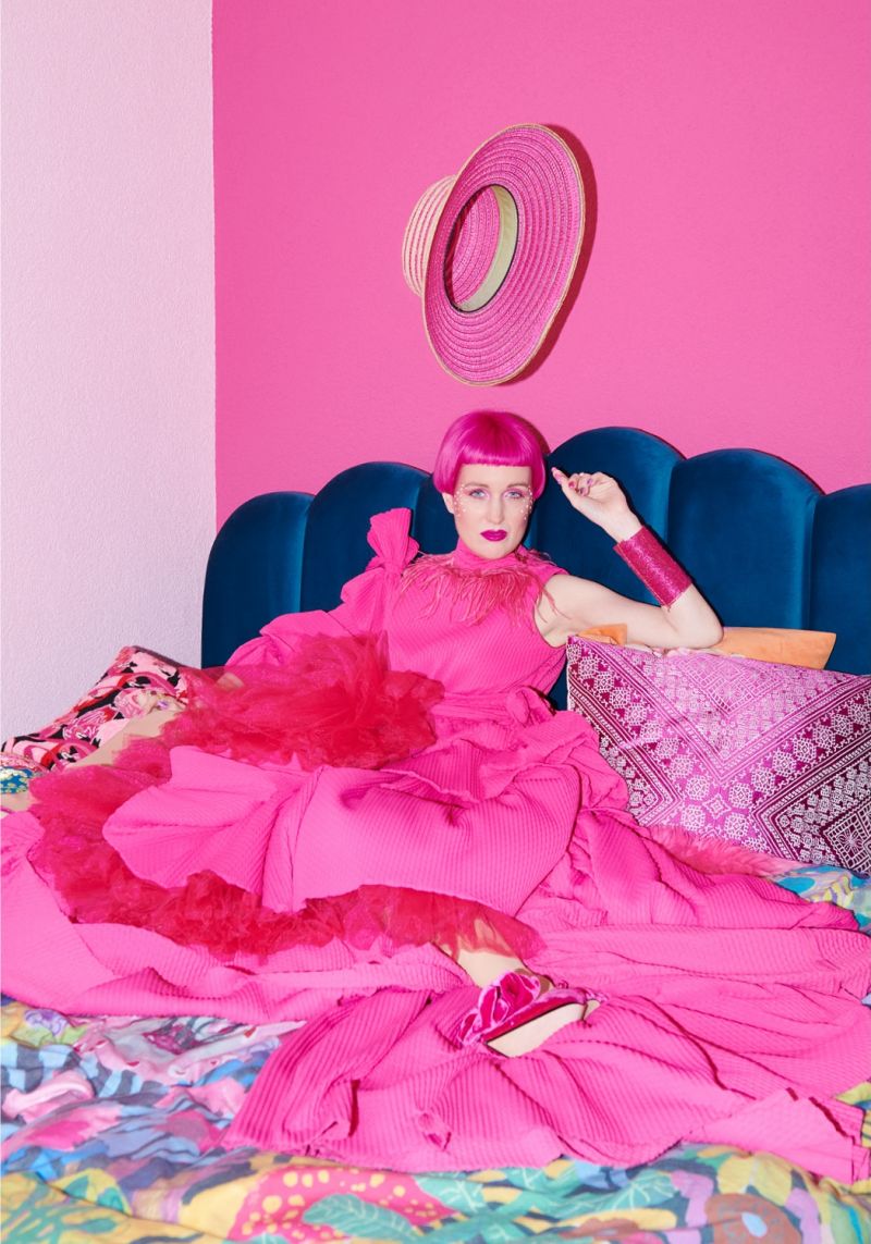
I have been thinking about colour again, which usually means the day is already wandering into peculiar and promising territory. Colour is the language I slip into before words manage their paperwork. It is my emotional warm-up, the tuning fork for the day. By evening, it becomes a different sort of compass. A blood orange Negroni if I need a little theatrical warmth, or that unmistakable yellow label on a bottle of Schweppes quietly signalling that the day’s duties are nearly done. Colour guides me from morning clarity to night-time unwind, with all the tonal mischief in between.
Take red, for instance. In December, it settles quite happily into its Christmassy soul, all mulled warmth and berry glow, the comforting sort of red that would never scandalise anyone. Fast forward a few weeks, and the same colour becomes suspiciously boudoir-coded. Paint a bedroom in it and suddenly people assume velvet curtains, late-night theatrics and a discreet chaise longue are lurking about (might give this a go). I always enjoy this misinterpretation. Deepen the tone, lower the temperature, and red becomes a quiet sanctuary, more cocoon than cabaret. Tone is everything.
I never follow colour trends. I tend to outrun them. By the time Pantone announces its new gospel, I have usually lived in the shade, repainted and moved on. Yet certain colours remain steadfast companions: brushed burgundy with the gravitas of an old library chair, fern green velvets with the calm of a hillside at five o’clock, and a flick of noir to keep everything properly grounded.
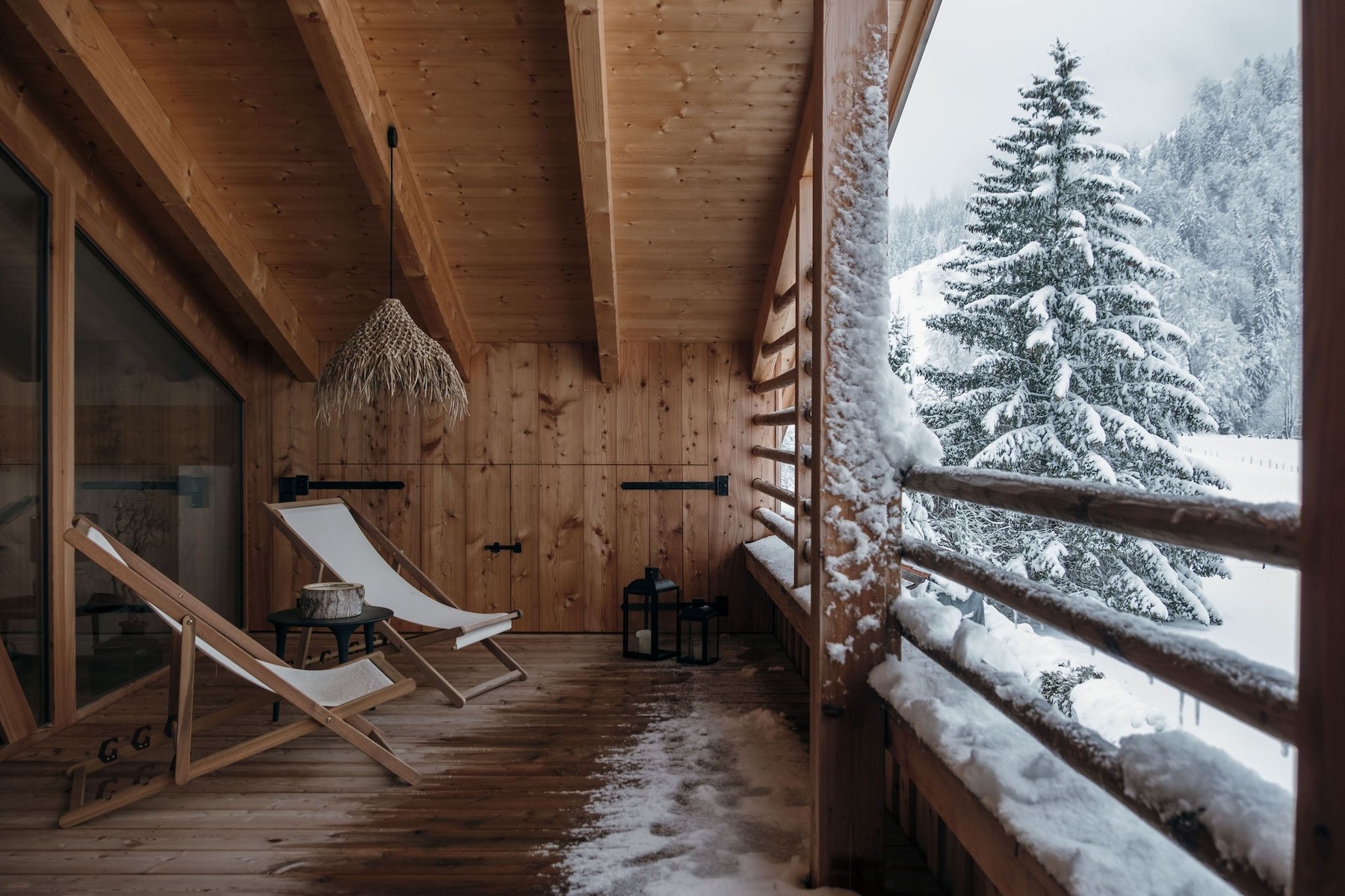
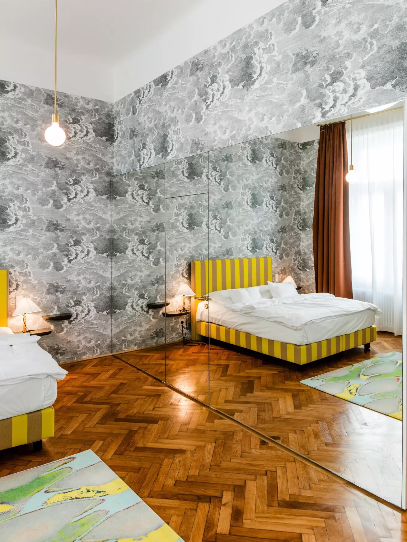
Pantone’s latest decree, Cloud Dancer 2026, is an airy white with the mood of a soft reset. After Peach Melba optimism and Mocha warmth, Cloud Dancer feels like a clean page, if not also a tad controversial in the design world. A moment of architectural clarity rather than a trend colour trying to impress the room. If you follow my tonal escapades, you may recall the newsletter dedicated to Béchamel, starring stieg’nhaus, whose designer, architect Carolyn Sarah Herzog of studio H kollektive, whispered the kind of wisdom that confirms my suspicion that calm interiors work wonderfully against a canvas of anything Alps.
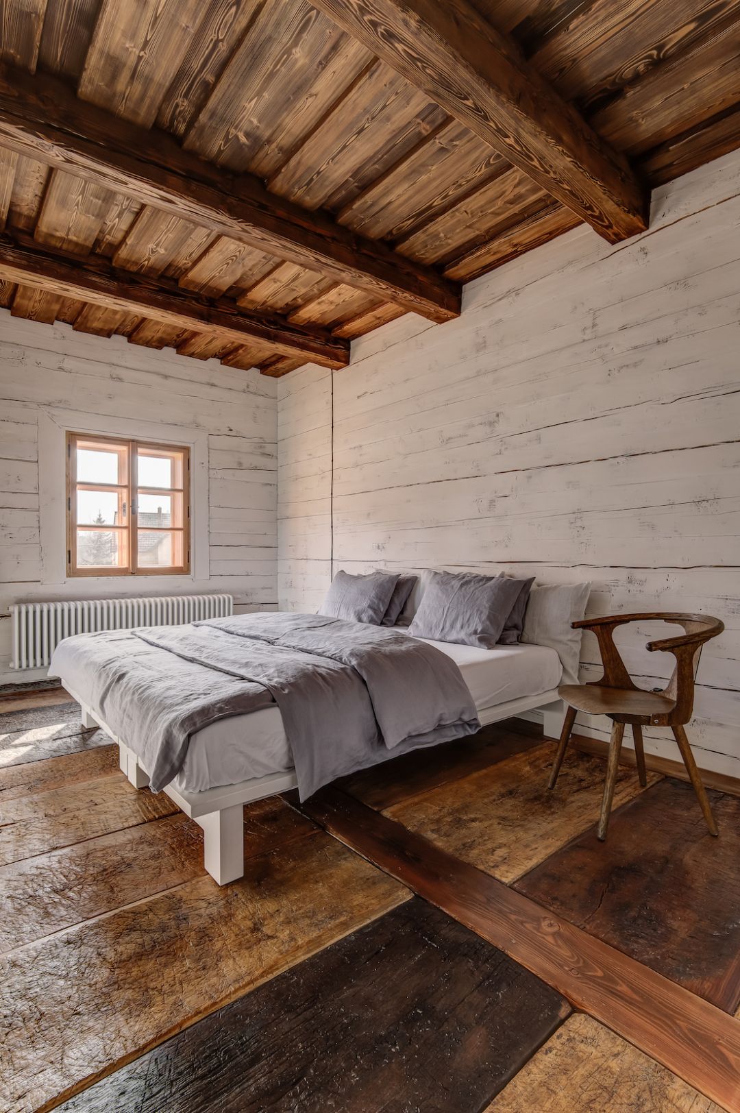
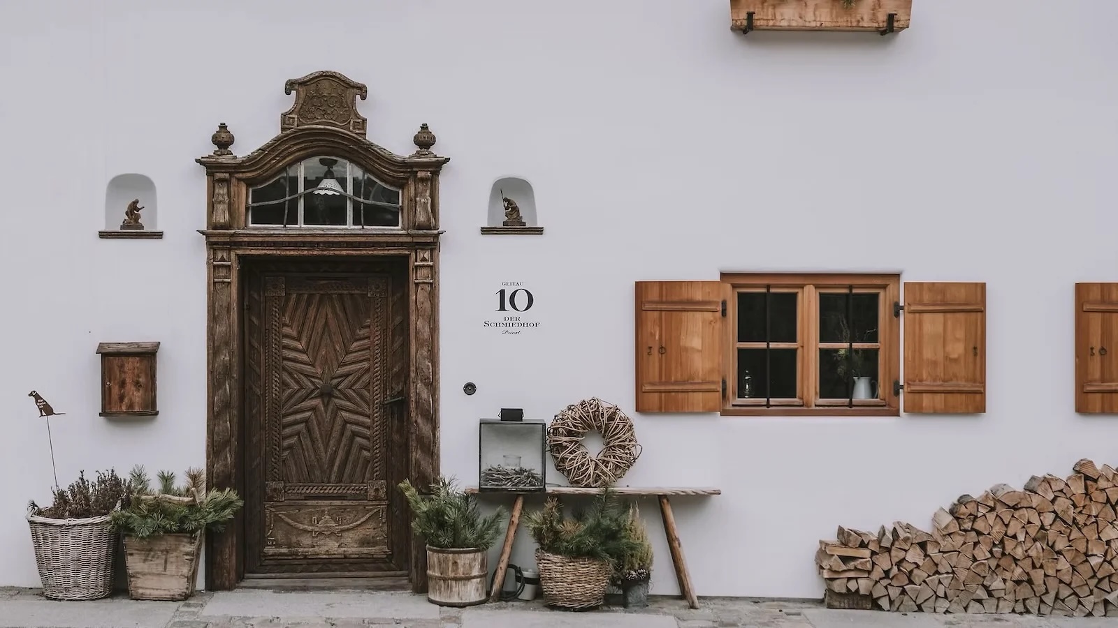
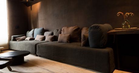
Perfect timing, because this week we unveil a new Bavarian bolthole that seems to have inhaled that same pale serenity. Der Schmiedhof, tucked into the small Alpine hush of Geitau, inhabits a five-hundred-year-old nail smithy reimagined with slowed-down modernity. A house where tone does the talking.
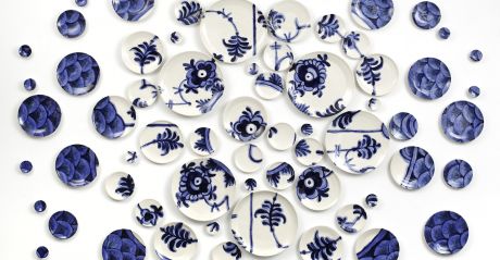
Colour, though, does not confine itself to walls. Zurich offers its own tonal delight in the form of Risa Hutwerkstatt, milliners since 1919. They coax wool, hemp and straw into trilbies, panamas and cloches using an iron and a wet cloth.
And because colour has always enjoyed misbehaving, history hands us a few reminders. During the French Revolution, green became politically risky because a royal mistress adored it. Medieval Europe treated blue with suspicion until the Church adopted it for the Virgin Mary and promptly canonised it into respectability. At the Bauhaus, Kandinsky insisted that yellow belonged to triangles, red to squares and blue to circles. Students quietly rearranged them at night solely to annoy him.
Pantone may name a shade, but it is the world around us that animates it.
Now, does my red overload of lights and baubles resemble a boudoir in the slightest? It was the first comment of the Austrian on my labour of decorating. It is Christmassy, pure as snow and my ageing soul, I proclaimed. I do not care what the neighbours think; it is a full-blown party in crimson. Humbug to anyone who objects.
Meanwhile, let's hope for lots of Cloud Dancer Snow to hit the slopes - Ski Edit is primed and ready.
Hugs,
Iain & Co.
Discover the hotels that give white, cloud and clock face white a hug, those calm temples where pale tones settle the room and every crafted detail gets its moment. Quiet colour, handled with wit and charm, feels almost decadent.
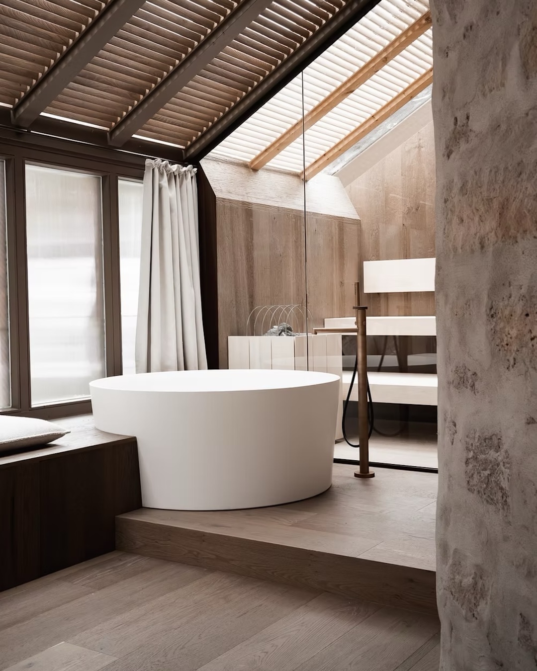
Hotel stieg’nhaus in Mühlbach am Hochkönig (close to Zell am See, Austria) captures Carolyn Sarah Herzog’s quiet Alpine luxury, where honest materials, structured plaster and elemental warmth define the stay. Guided by her studio H kollektive, the hotel pairs mountain grit with architectural clarity for a calm, intelligent refuge.
Gorgeous hotels wrapped in seductive mocha tones, from the Beskydy Mountains to a New York penthouse, with an Alpine nod and a German classic in honeyed timber. Meet our luscious lineup of trend-steeped Hotel Mocha’tels, rich and utterly irresistible.
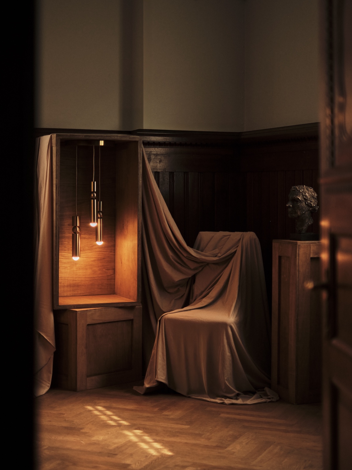
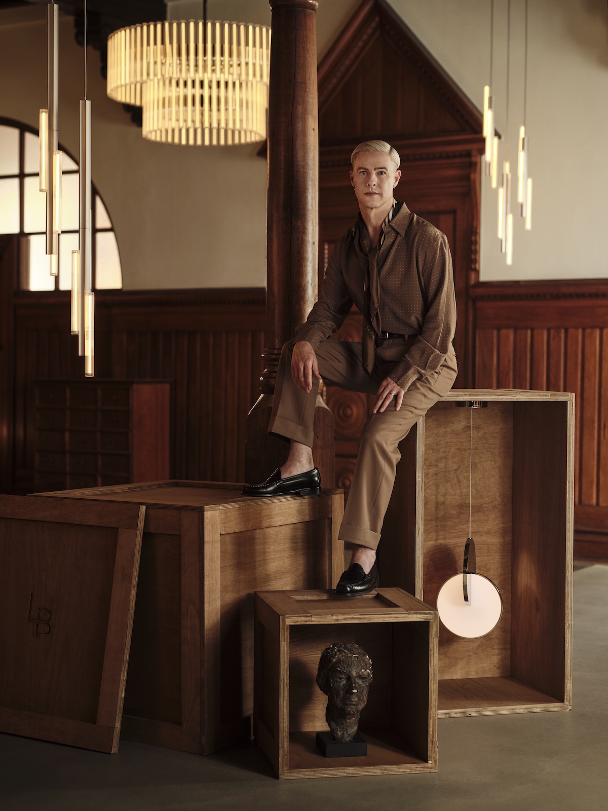
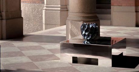
British designer Lee Broom turns light into theatre, blending heritage with modern poise. His pieces from Eclipse to Vesper play with illusion, sculpted form and emotional materiality, creating performances that elevate interiors with cultured, quietly eccentric elegance.
Detoxing on Peach Melba feels about right. Pantone, the Matterhorn, Alpino, a candle and the perfumer’s jam set the tone for this Edit. Switzerland gets a gentle swoon and Peach Fuzz '13 1023' has Iain completely seduced.

Feelgood sunshine yellow leads our wander through a collage of sunshine toned delights from Bram Stoker's Dracula first edition to hotels and makers who love lemon tones. But of course, this was the year that shared a title and crowned sibling colour of the year 2021 by Pantone’s tonal gurus, '13 0647' takes its place beside the steady calm of grey '17 5104'.
Risa Hutwerkstatt, Zurich’s cool milliners, craft handmade hats with century-old techniques and natural materials. From trilbies to panamas, each piece blends heritage with modern ease, shaped by a third-generation workshop that keeps Swiss headgear stylish, characterful and wonderfully relevant.
Munich designer Stephanie Thatenhorst shapes spirited interiors for Ullrhaus, MYKITA and beyond, mixing crafted materials with bold personality. Her chameleon style brings playful precision to hotels, retail and homes, turning every space into a joyful original with quietly confident flair.
|
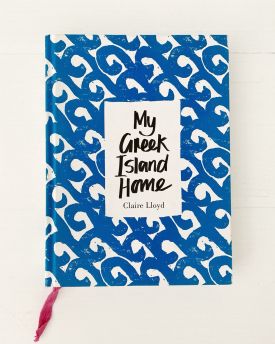
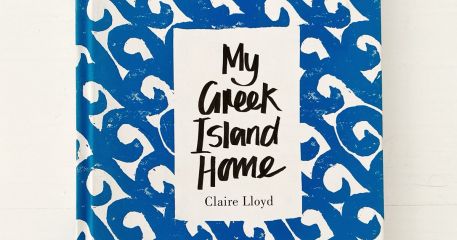
My Greek Island Home by Claire Lloyd is always out of the bookcase, an ever-present friend that tells the tale of falling in love with a Greek island and finding that a simpler life is not so bad after all.
read more
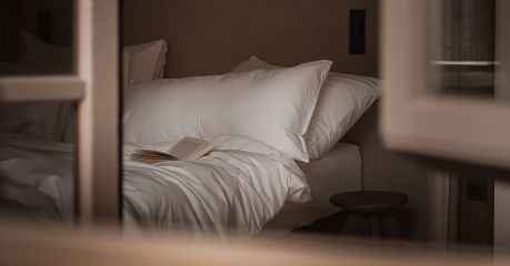
White takes centre stage, from Alpine retreats to Umbrian casas, where textured palettes flirt with light, craft and architecture. A fresh journey through Béchamel tones reshaping today’s most inventive hotel interiors.
read more

Anchored to specific genres of hotel design, The Aficionados print editions: Unwaxed Lemons, Neu Alpinistas, Farmhouse Fabulous, Casa Gorgeous, Blueprint Beauts, Neu Heritage, Eclectic Rebels, Design Natives and Alchemists of Italy take the reader through the creation narratives. A sourcebook for hoteliers, travellers, style aficionados and those who appreciate design.
read more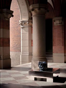
Gothenburg's pitstop for a mix of youthful design alongside the established patrons, Artilleriet fuses across the spectrum from furnishings, handwoven rugs to the best in ceramics.
read more

From Belle Époque boltholes to 1920s villas, the Dissertori brothers revive South Tyrol’s heritage with soul-rich interiors and a casual-luxe touch that redefines cultural, design-led hospitality.
read more

Architect Carolyn Sarah Herzog and studio H kollektive opened a dialogue with sculptured plaster, stone, shadow, crafted tactility and a disciplined mountain stillness to shape stieg’nhaus, luxury Alpine retreat in Austria.
read more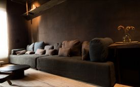
Pantone's Mocha Mousse leads the colour charge, guiding us from St Anton to Venice and the Beskydy hills, where hotels, designers and makers shape chocolate-toned interiors with warmth, craft and seduction.
read more

Four cute bastions of style and snuggle up in the duvet sentiments for winter, none of which are in France.
read more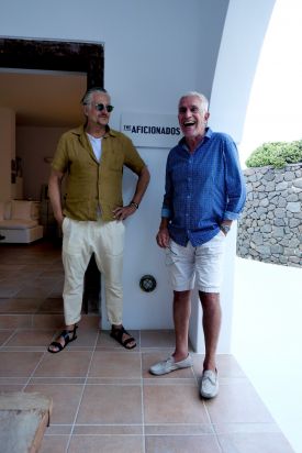

Sisters of spaghetti, sibling architects, ethical knits, dad+son chefs at a place with no menu, to the hotels created by the minimalist aesthets – the Schgagulers, the curators – the Wiesenthals, and the glampot nostalgists – the Dissertoris, and we hop over to Syros where sisters Jasmine and Oana are rewriting island style.
read more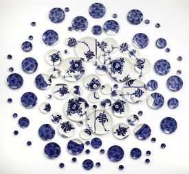
A city of effortless cool & pioneering Scandi design Copenhagen has long been at the heart of the world’s ceramics stage, from practical to the performative.
read more
Lisbon, Portugal's legendary capital simply bursts with heritage, azulejo tiles, Pastéis de Nata & art - this is a design guide you can shop, see & drink.
read more

Director of internationally acclaimed Vienna Design Week, Lilli Hollein had never yet turned her eye to interior design until Vienna's Hotel Altstadt came knocking.
read more
Get the insider news and lowdown on what we've been up to, where we've been, and who we've met along the way. Be the first to discover new places and get the scoop on our favourites.