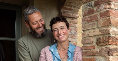
JOIN the AFICIONADOS
Get the insider news and lowdown on what we've been up to, where we've been, and who we've met along the way. Be the first to discover new places and get the scoop on our favourites.
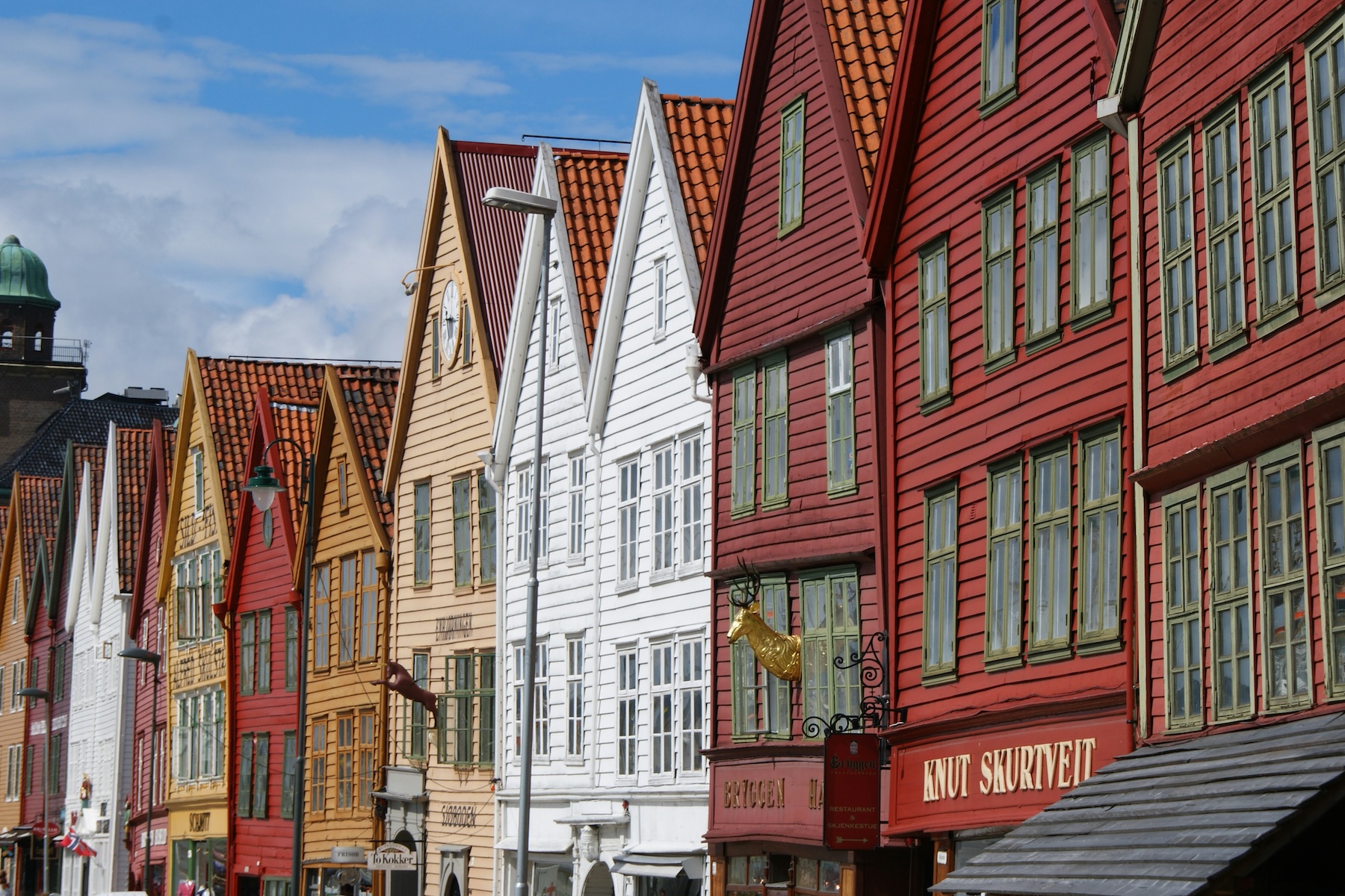
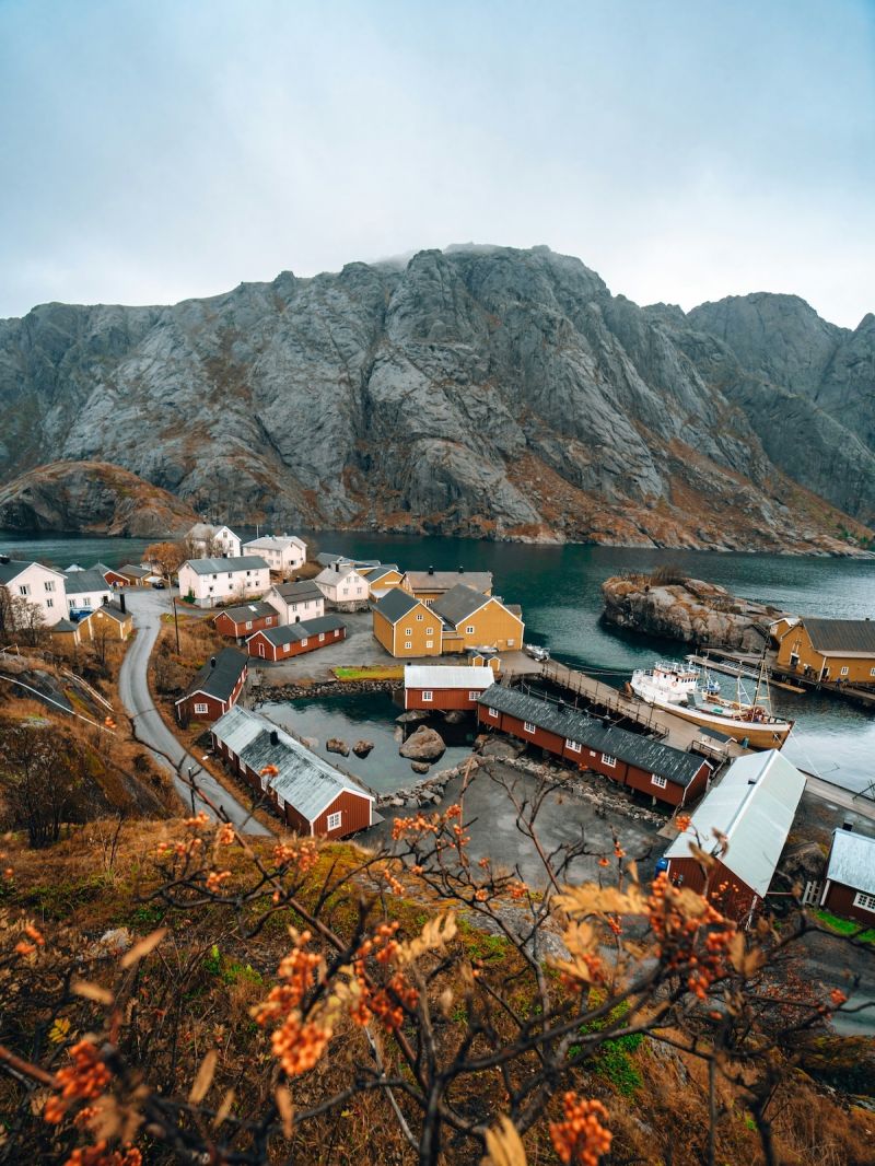
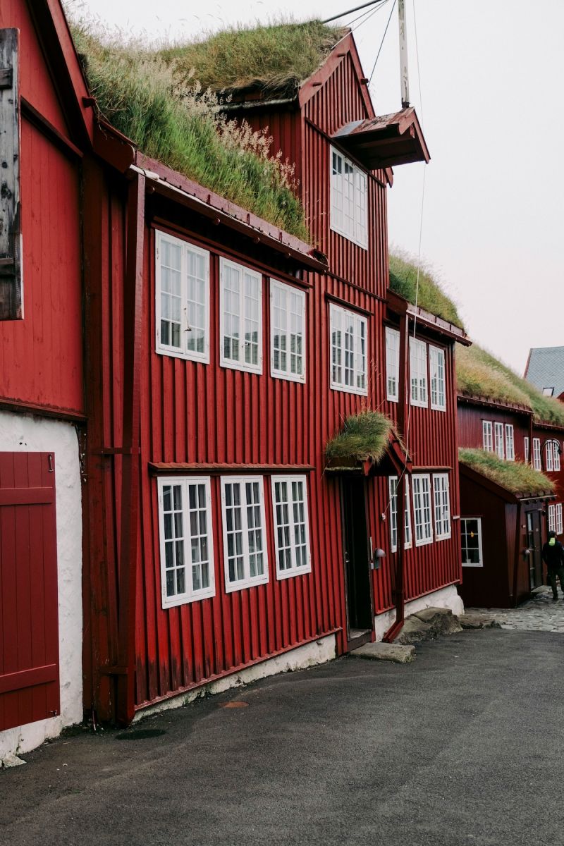
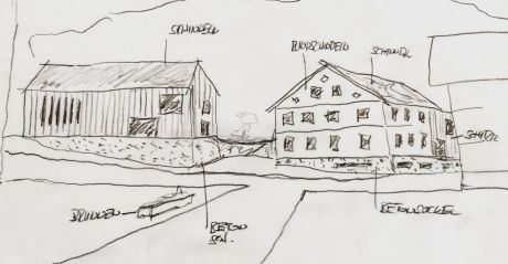
In Norway’s fishing villages, colour is more than aesthetics. It is a design code, a marker of purpose, and a visual expression of a past social hierarchy. The deep, earthy Falu red (falurødfarge) dominates, wrapping wooden fishermen’s cabins (rorbuer), barns, and boathouses in a bold, functional uniform. More than just pigment, these colours have shaped the identity of Norway’s coastal architecture for centuries.
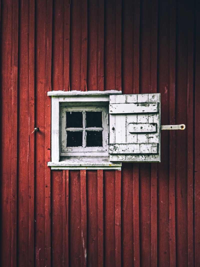
Falu red originated in the copper mines of Falun, Sweden. By the 16th century, this iron-rich by-product became a sought-after paint. Its composition provided a natural defence against rot, moisture, and the relentless Nordic climate. Durable, affordable, and easy to apply, it spread across Scandinavia, finding its strongest foothold in Norway’s coastal settlements.
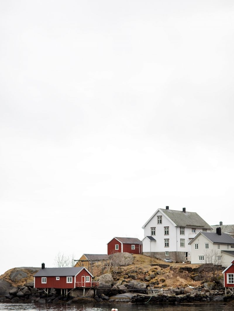
Here, red was not a choice but a necessity. It coated the buildings that endured the elements, including fishermen’s cabins, boat sheds, and storehouses. It also blended effortlessly with the dramatic fjord landscape. But red is not the only colour of fishing heritage; lined up in the trio is also Oker gul, a rich yellow-gold, and a reflective sail-white usually coating the community's most prestigious buildings.
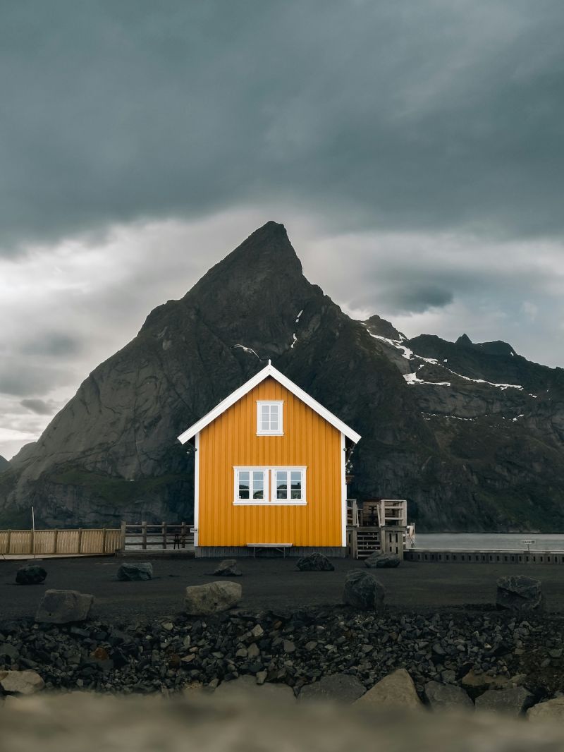
Norwegian fishing villages developed a practical and symbolic colour hierarchy. A building's colour instantly revealed its function and status.
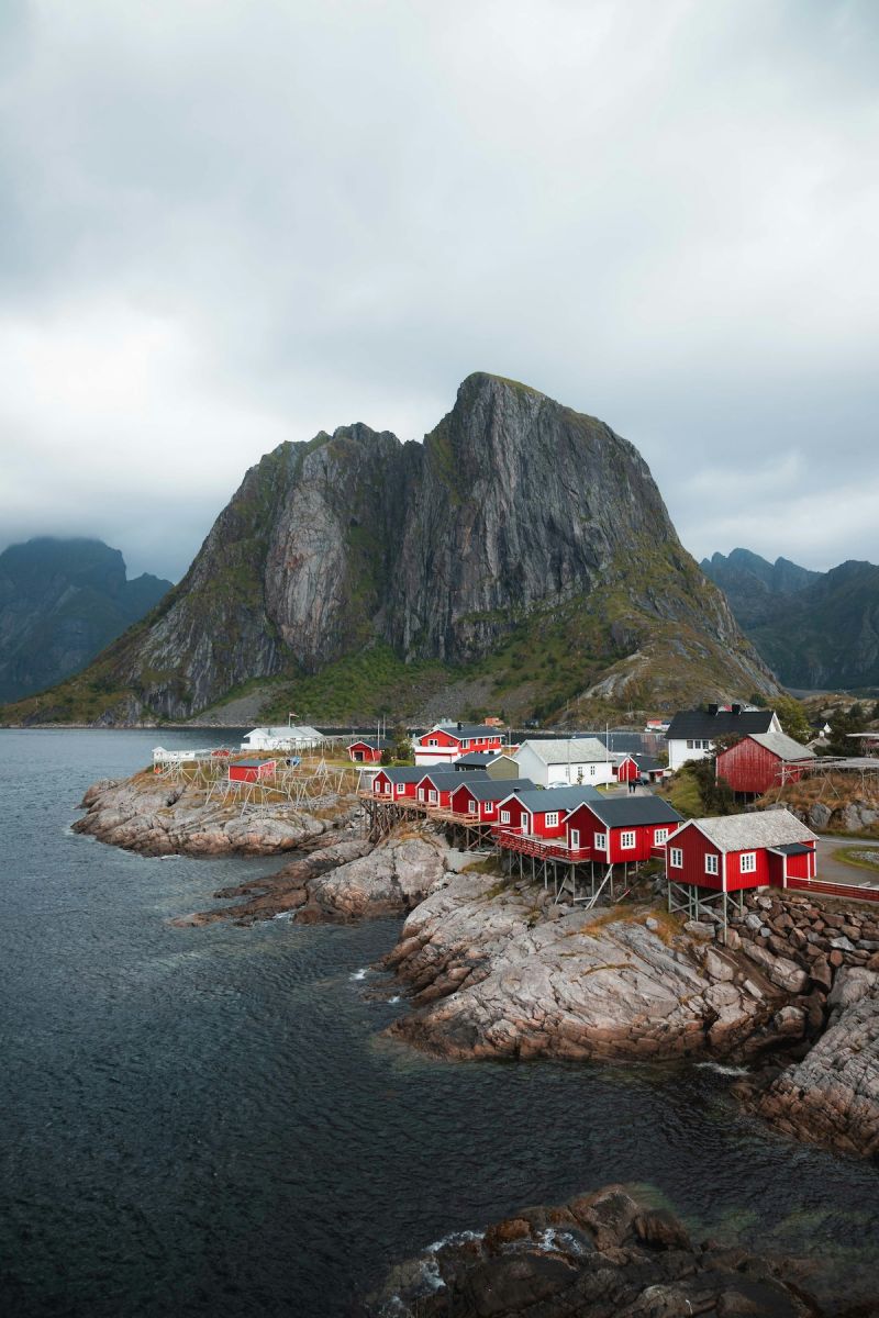
Today, Norway’s coastal villages still follow this chromatic tradition. The colour hierarchy remains intact, not out of necessity but out of deep-rooted design awareness. The red cabins of Nusfjord Arctic Resort & Village, Reine, and Å stand against the blue sea, their white and yellow counterparts punctuating the skyline with calculated contrast. Modern architects and designers continue to draw inspiration from this approach, using colour as identity and ensuring form follows function. This is a rustic tradition and a masterclass in visual hierarchy, environmental adaptation, and material honesty.
What was once a practical solution has become an architectural language, proving that the most timeless designs are those rooted in necessity, clarity, and a profound sense of place. Today, in keeping with heritage, the paints used today are sourced from a more organic nature but still include linseed oils, clay, wheat and rye flour.
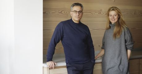
Stylish, natural, casualwear, knits, t-shirts + crafted closet essentials that are ethical, sustainable, carbon neutral and natural, created by Petra Brichnacova and Esteban Saba.
read more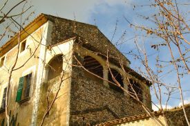
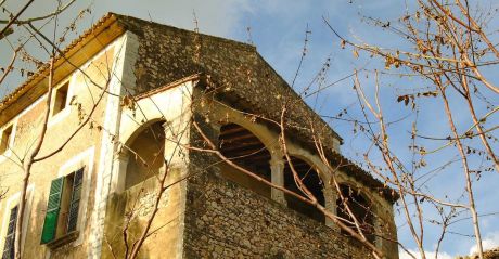
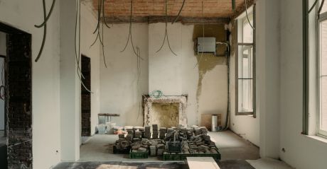
Built as an ‘alqueria’ (an Arabic farmhouse) in the 12th century during Mallorca’s Arab rule, which then became a Jesuit monastery in the 18th century, the house and grounds were in ruins; the estate utterly overgrown.
read more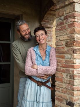
As the property neared finishing, Fabio took the decision to keep the garden wild and naturally indigenous – where the boundaries between garden and rural countryside were blurred.
read more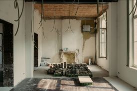
Are we insane? Welcome to a gallery of brick ruins and love stories, and pleasingly, it has nothing to do with Valentine’s.
read more

Sisters of spaghetti, sibling architects, ethical knits, dad+son chefs at a place with no menu, to the hotels created by the minimalist aesthets – the Schgagulers, the curators – the Wiesenthals, and the glampot nostalgists – the Dissertoris, and we hop over to Syros where sisters Jasmine and Oana are rewriting island style.
read more
A think tank for the bold, the curious, the creators of tomorrow. Where minds collide, conversations spark, and urban life gets redefined. If you shape the future, you belong here.
read more

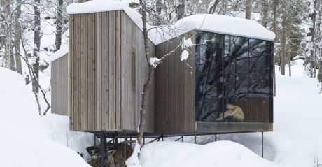
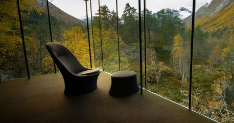
Norwegian-based architectural firm, Jensen & Skodvin Architects are well known for their striking, often extraordinary designs, some of which are found in wild and remote areas; others camouflaged in urban hubs, with their engaging use of tectonic architecture.
read more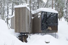
Four cute bastions of style and snuggle up in the duvet sentiments for winter, none of which are in France.
read more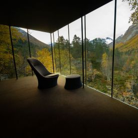
Where wilderness meets radical architecture, soulful stays and culture-led adventures – join us in chasing raw nature, good people and unapologetically beautiful escapes across the wild corners of the world.
read more
Ten architectural hideaways, from forest pods in Norway to vineyard villas in Alentejo. Alpine modernism, island calm, Lisbon rhythm and one breezy Turkish beauty. Small hotels with big design thinking.
read more
Did you know that around 84% of the world’s rough diamonds pass through Antwerp’s diamond district? With an annual turnover of around 54 billion dollars, it makes Antwerp the largest diamond district in the world. Explore why.
read more
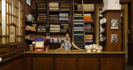
Devoted to the crafts of Portugal, the emporium A Vida Portuguesa is your pitstop ceramics, hand-made woollen blankets, glassware to napkins, stationery to baskets - all made in Portugal.
read more
Get the insider news and lowdown on what we've been up to, where we've been, and who we've met along the way. Be the first to discover new places and get the scoop on our favourites.